FIND YOUR PERFECT MATCH
Make a statement by matching your art to your wall! Four styles in four different rooms, which one's your favourite?
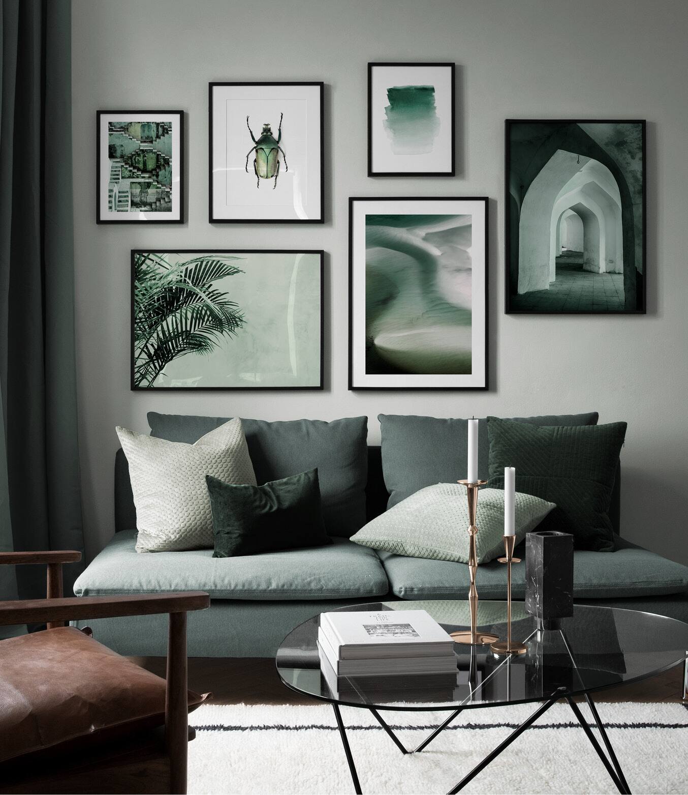
Do your favourite prints justice by providing a backdrop to match! This styling trick is perfect when you want to create a calming vibe at home and works with any colour scheme. We’ve fallen in love with mixing different shades of green to give this room a peaceful energy. Bring the feeling of being outdoors in!
 |  |
Using contrast when decorating is one of the most effective ways to add that little something to your space. Contrast is an important element of composition, so don’t be afraid to use it! In this room we’ve created contrast by adding orange and peach toned wall art to a beige wall.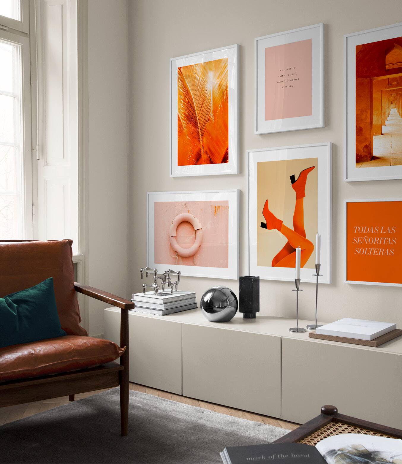
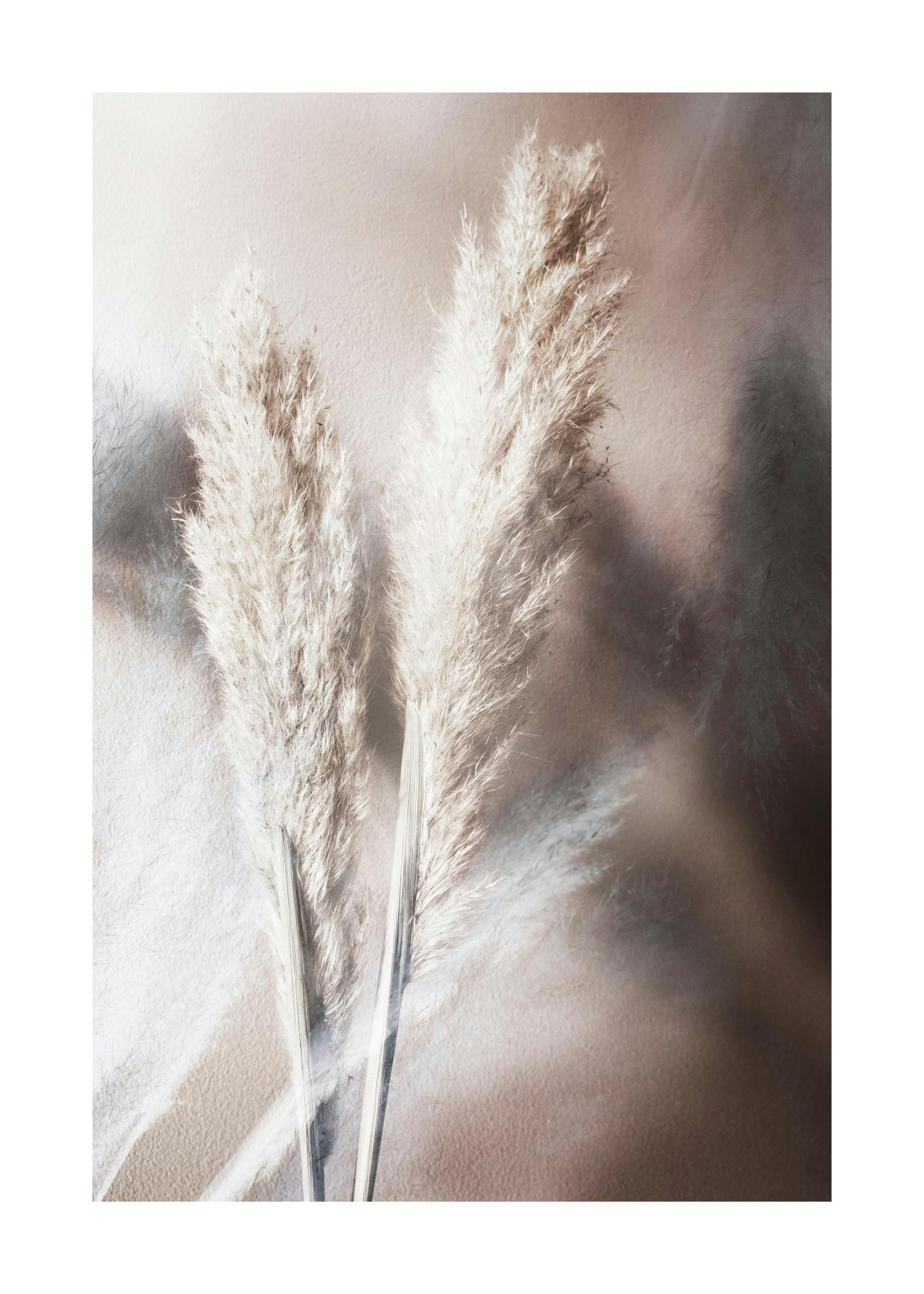
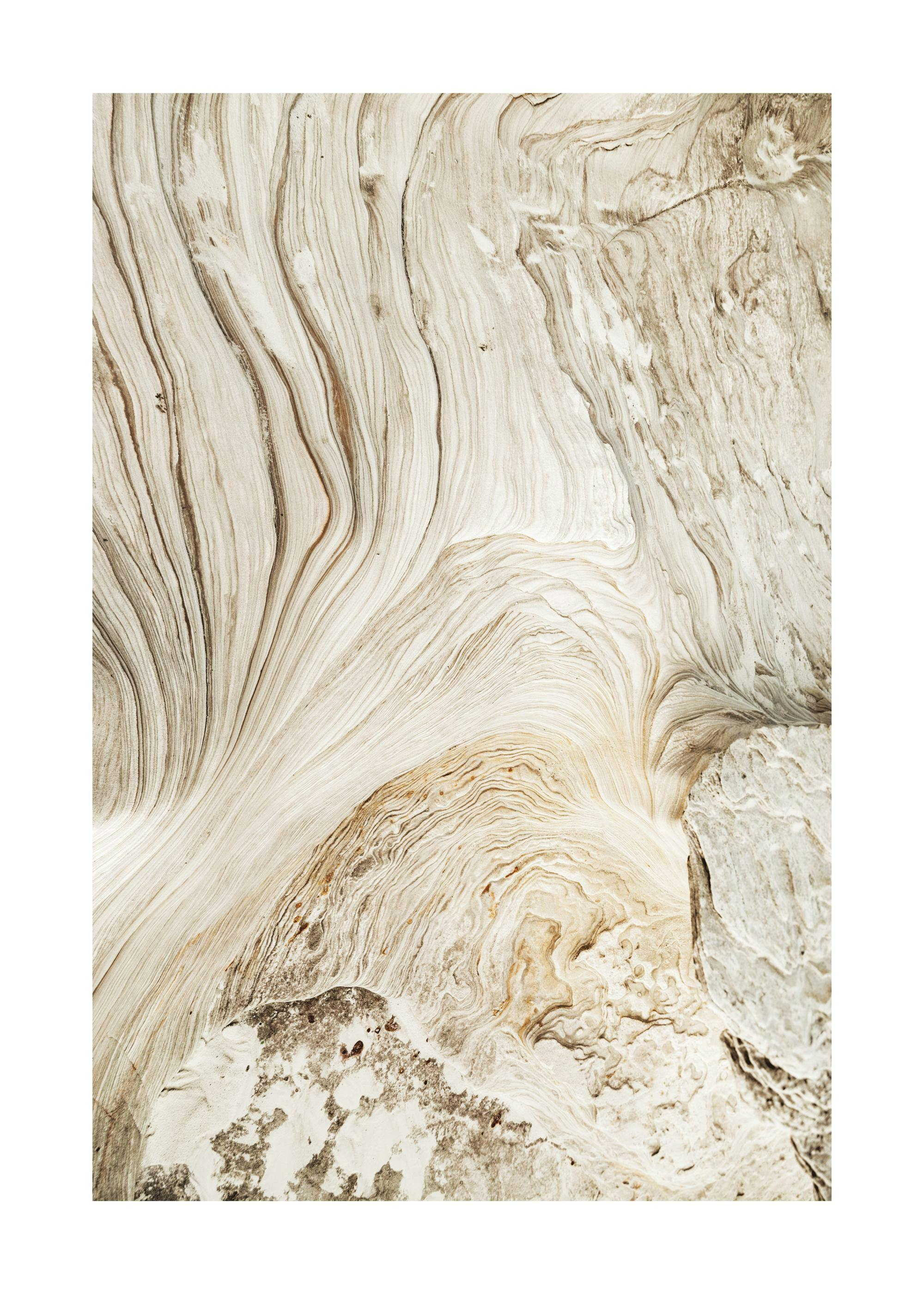
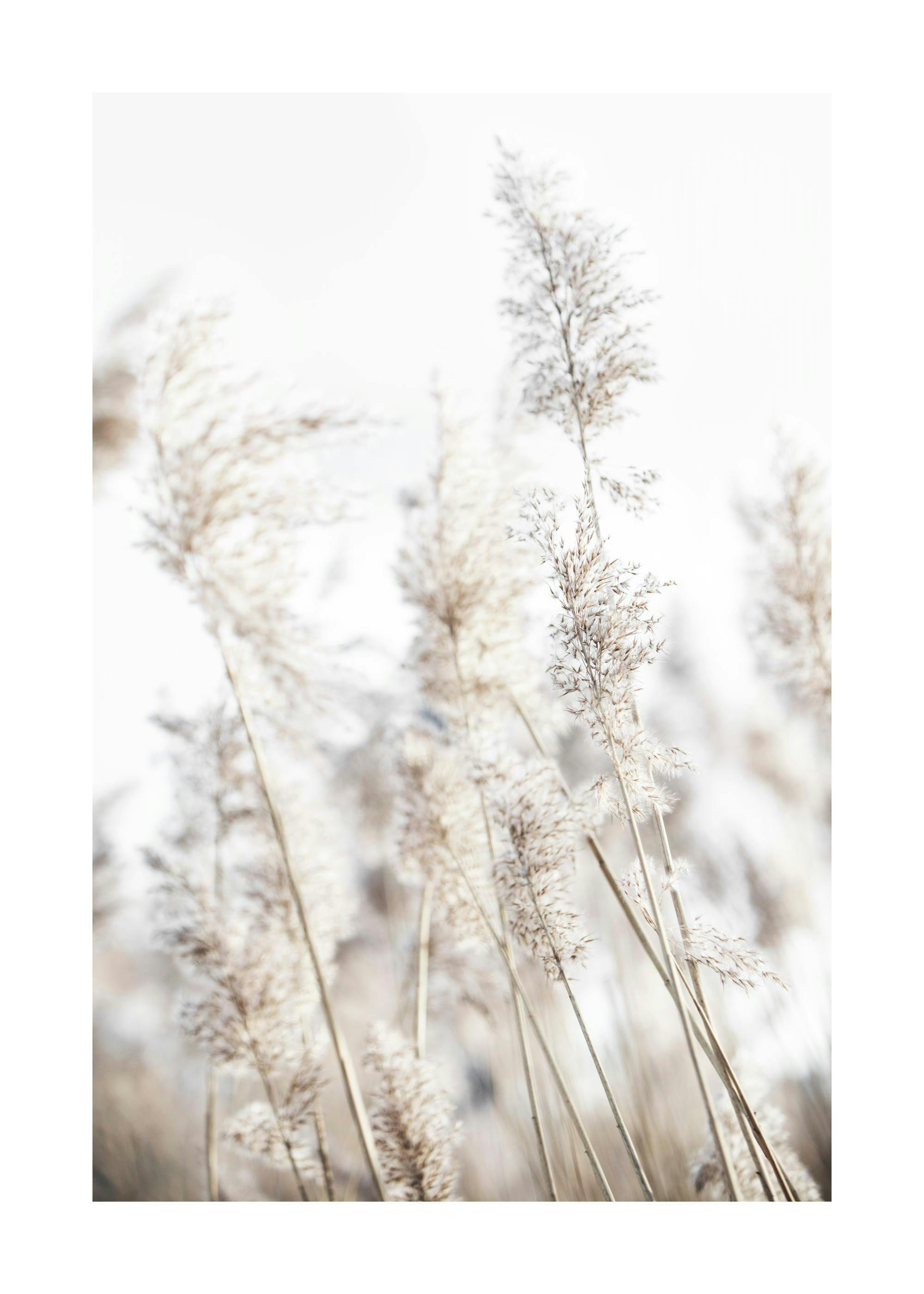
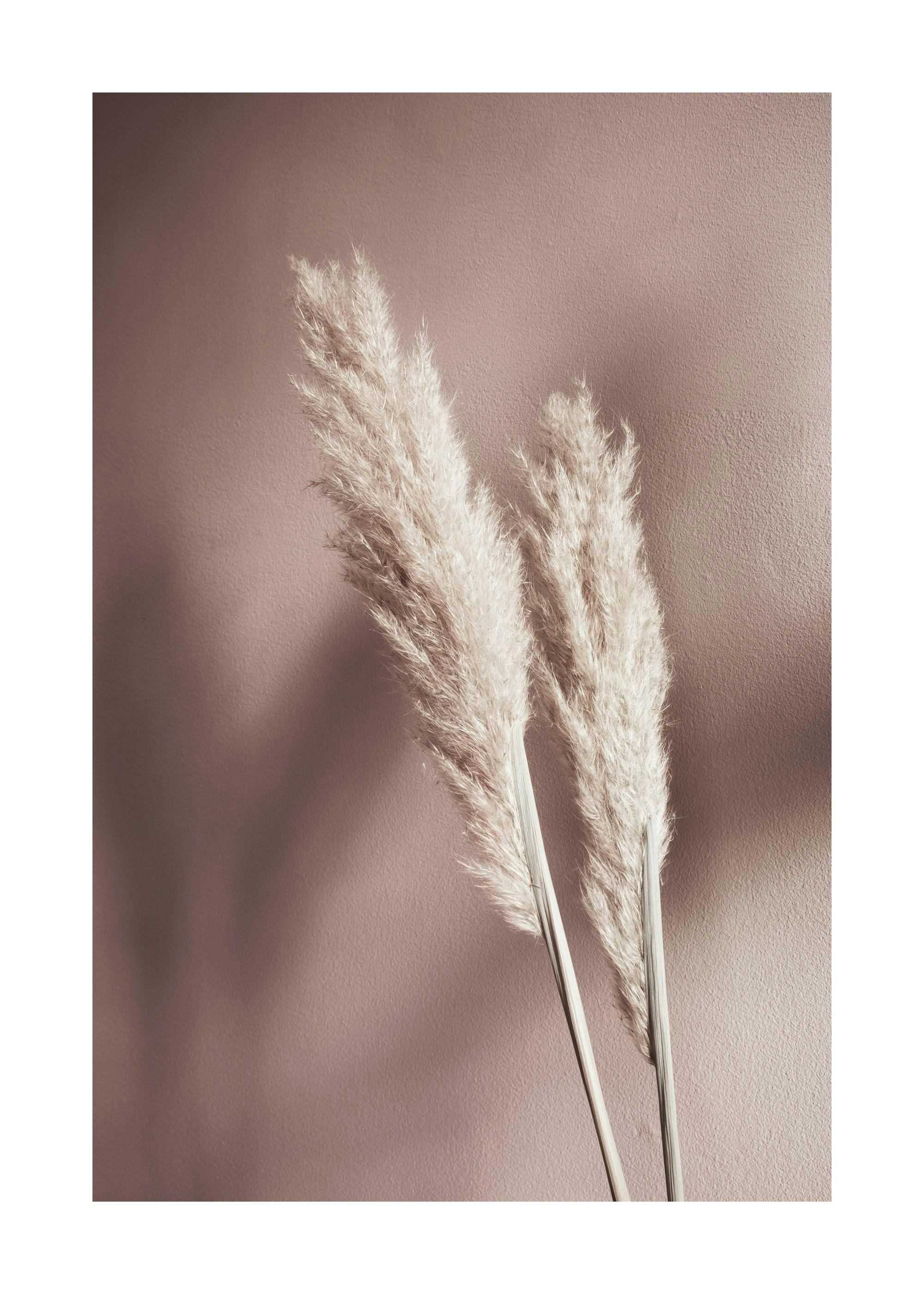
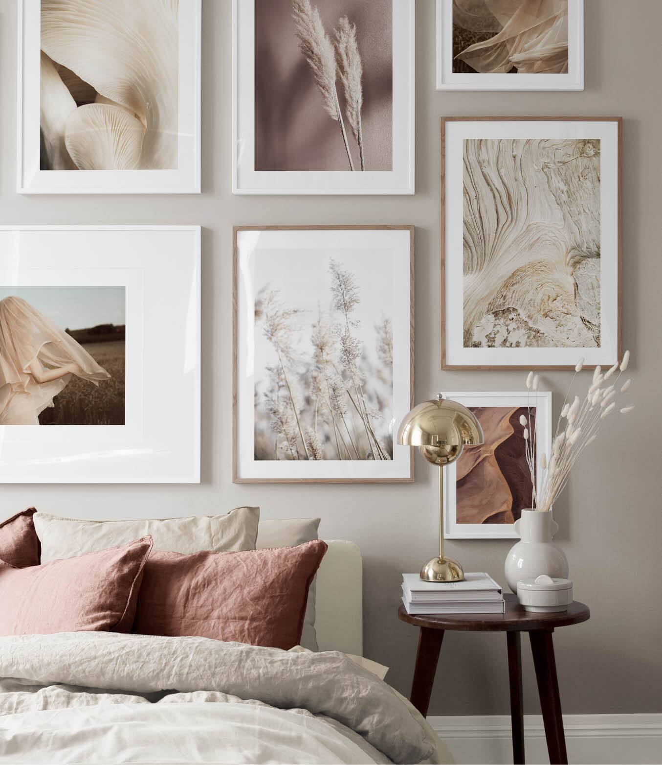
Tone-on-tone is a sophisticated way to curate your gallery wall. One of the biggest trends this spring and summer both in interior design and fashion, we love using this mindset while decorating! A versatile method that can be applied to all styles and colour schemes. Get inspired by our tone-on-tone neutrals. Blending white, creams and taupe gives your space a clean and modern feel.
 |  |
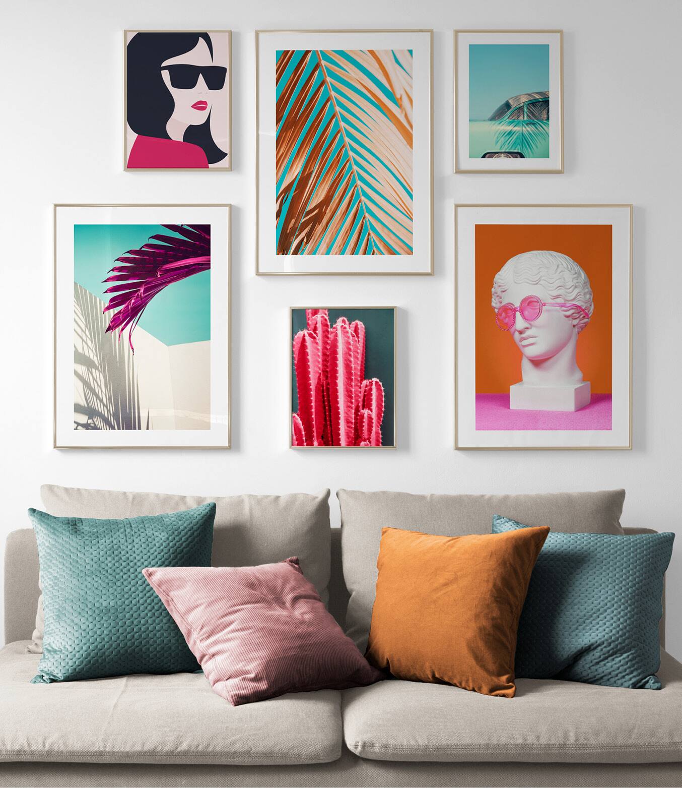
Do you love a pop of colour as much as we do? Using bright colours in a neutral room creates an interesting dynamic and a modern feel. Use your favourite art prints and let them take centre stage. A white wall is a perfect background for your statement piece!