Art Advice at home with Nicole Kavander
We recently visited travel writer Nicole Kavander at home to help her find art for a few different rooms. The aim was not to create a polished, showroom-like home, but rather to ensure a warm, curated and personal home that felt collected over time. Nicole and her partner Alex were specific that every room should not match, though the overall tone should feel cohesive.
Nicole is an incredibly energetic, warm and cheerful person and welcomed us into her home with open arms. By showing us around and explaining how each room was used for and what was important to them in choosing art, she gave us an excellent introduction into how to balance her and Alex’s personalities and styles.
Our Art Advisor, Sanna rose to the task, creating four different aesthetics, that manage to feel complete, held the story of a life together, and enhanced each space with identity and scale. Here’s how.
The living room - one piece to complete the space
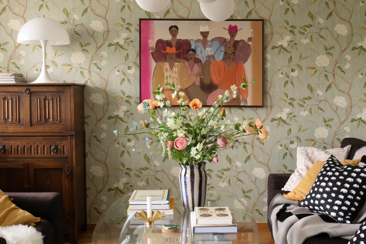
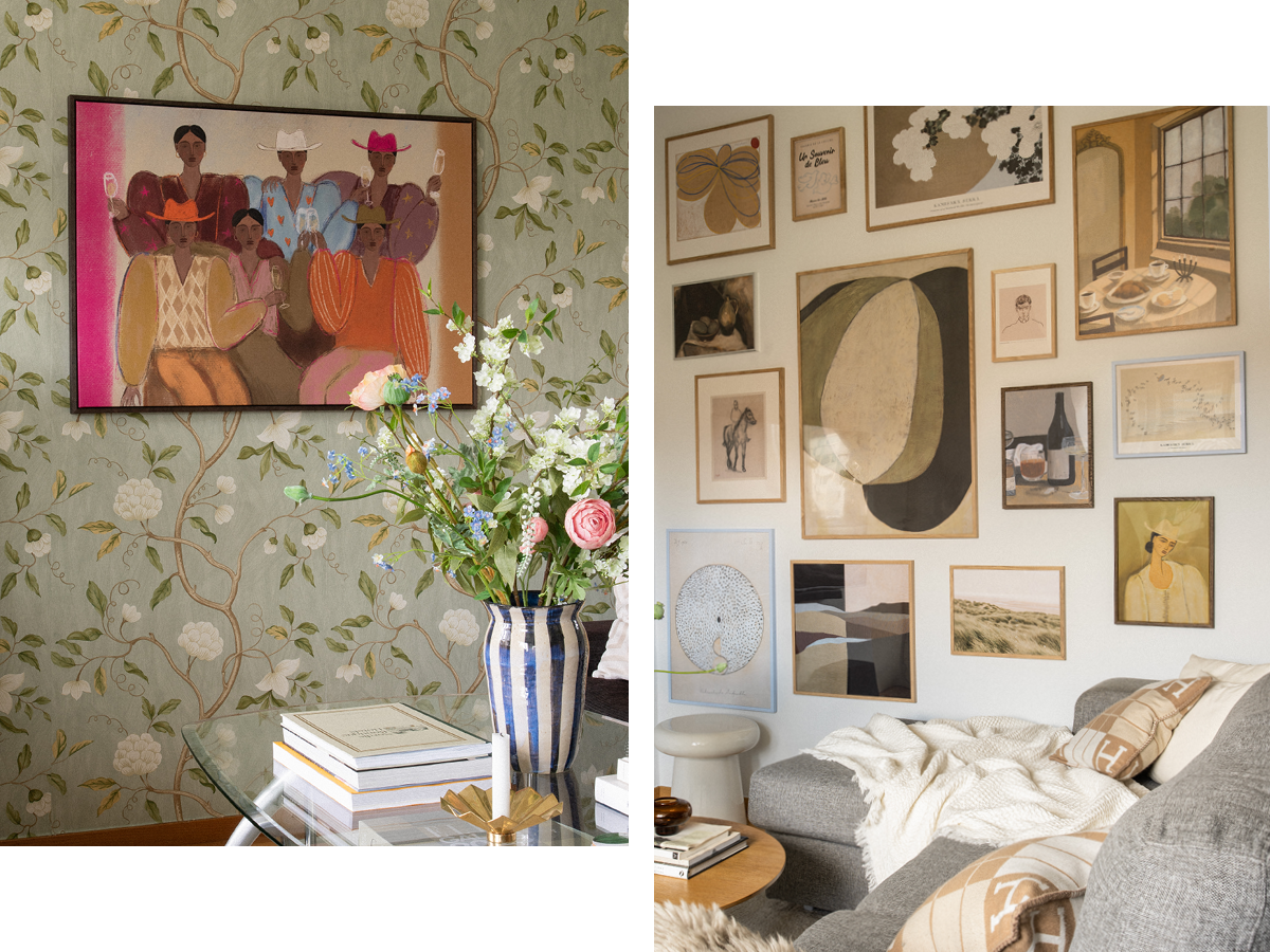
The living rooms is described by Nicole as ‘simmering.’ It features a wallpaper with a strong botanical print in a stunning array of soothing greens and blues. To ensure that the artwork didn’t compete with the already bold pattern, Sanna selected a large piece in contrasting colours that was figurative, bringing a different dimension to the space. The piece, one of our bestselling works by Studio Vreeken, a Dutch artist, celebrates the joy of coming together, so is perfect for a communal space like a living room.
Tip: Don’t feel the need to fill every wall. In a room with a lot going on, a single piece can bring everything together.
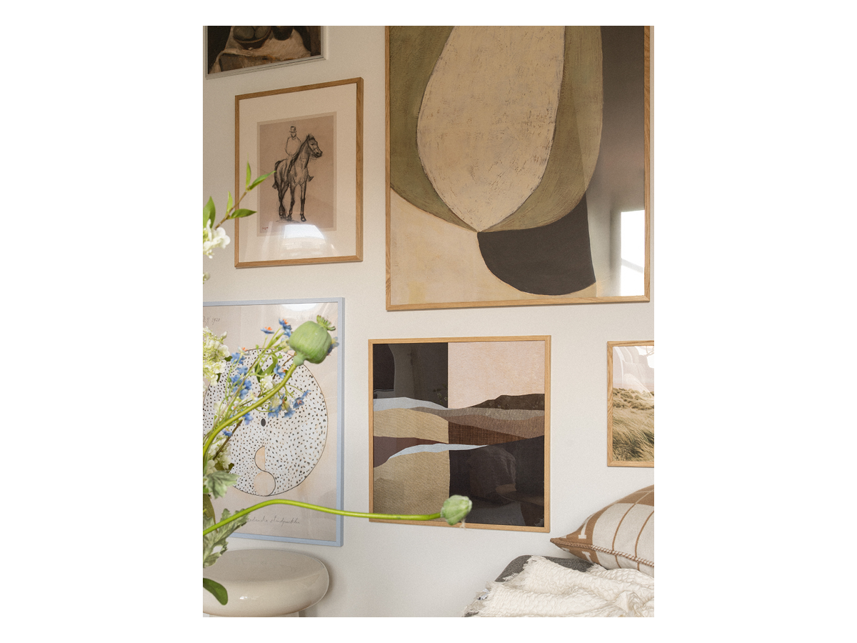
The TV room - a curated-but-not-matching gallery wall
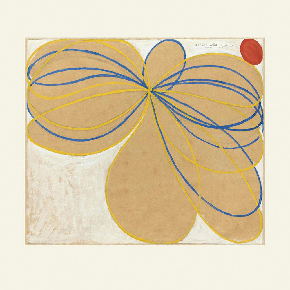
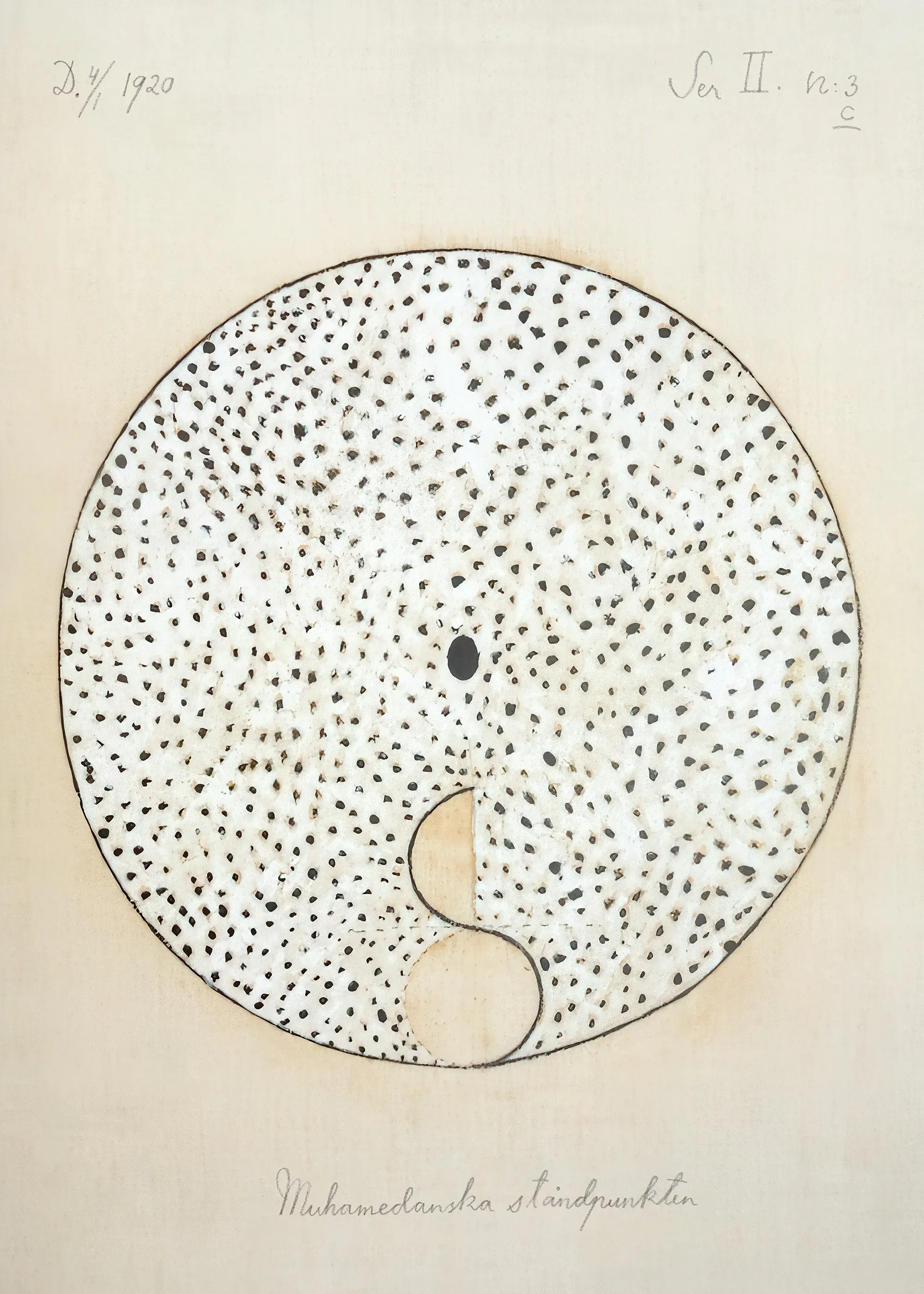
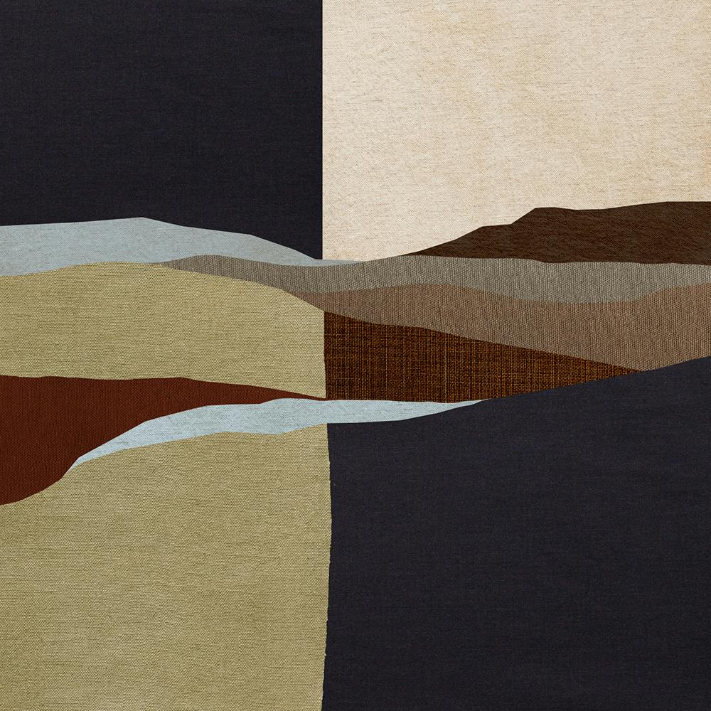
In the TV room, there was a large wall where Nicole and Alex wanted to create a warm hotel lounge feeling with a big gallery wall. Nicole's brief was to include a mix of styles and sizes: painterly, abstract, architectural, photographic, and something a little more graphic. In the gallery wall that Sanna created, there's real variety but with a strong common thread in the color palette. This room is perhaps the best example of curated, not matching.
Tip: A gallery wall does not need to be made up of a pieces designed to go together. Look for small connections in color, form and dare to blend different styles.
The Stairwell - one statement piece
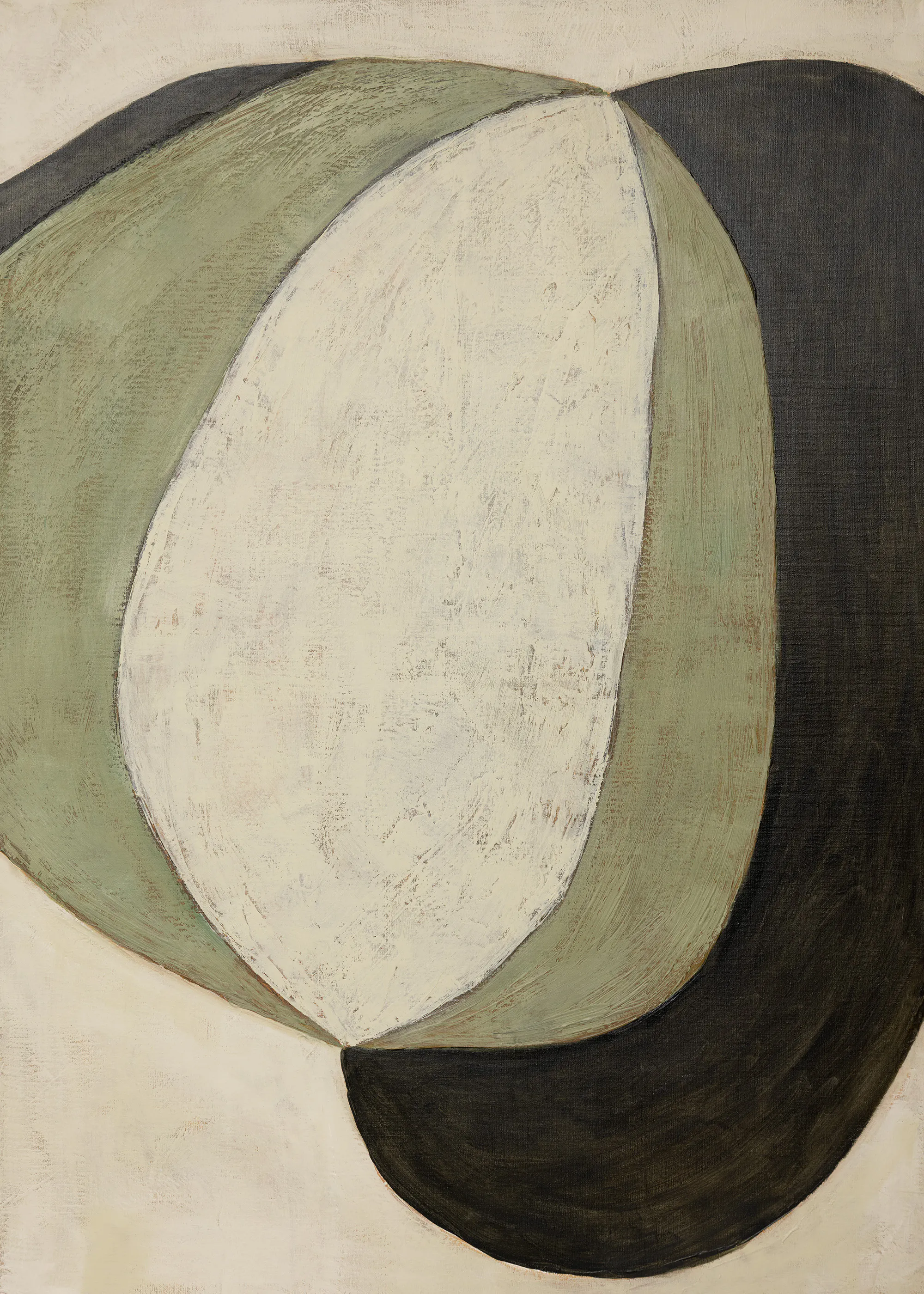
A stairwell is a high traffic area of the home, somewhere you pass through daily. In Nicole and Alex's home there is a high, airy space. Nicole describes the space as the home's 'premium moment' and wanted to give a striking piece space, rather than a classic poster solution. Here Sanna used the opposite solution to the TV room and picked out a single artwork that could hold its own in the space. The artwork chosen is a beautifully textured piece by Swedish artist Anna Mörner.
Tip: Work with the architecture of the space when you choose art. Sometimes a single piece can hold more weight that several smaller ones in an unusual space.
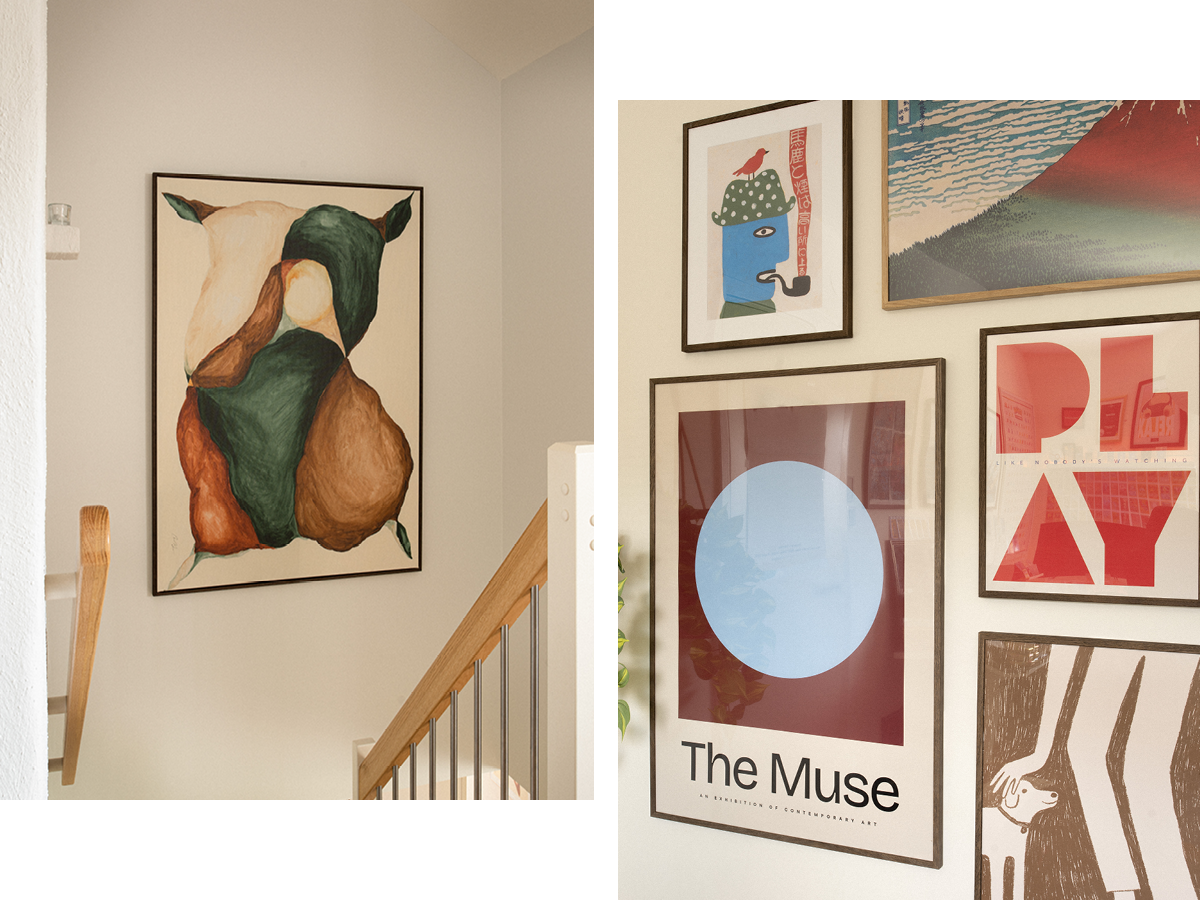
Alex's room - more personality and energy.
In Alex's office and gaming room they both wanted quite a different feel to the rest of the house, and since the art would provide a background for Alex during video calls, the brief was specific. It should include more graphic urban references: to be precise, it should conjure a creative studio meets a Tokyo record bar. The result is considerably more graphic, colorful and playful than other areas of the home.
Tip: Don't worry about each room sharing the same style: let the person who actually uses the room influence the art choice. It makes the home feel more personal.